Sunstroke: past and present
Sunstroke 1.5 has just been released to the App Store. This update isn’t a feature update. Rather, I focused all my energy on improving the user interface and user experience of the app.
Before I talk about the specific changes I made to Sunstroke, let me give you the backstory of the app. I first started working on Sunstroke back in the days of iPhone OS 3 (yes, it was called iPhone OS, not iOS, back then). I was living in China and, up until that point, had been using Google Reader and NetNewsWire on my iPhone. Living in China, I was constantly worried that the Chinese government was going to block all access to Google services. Since I was (and still am) such a news junkie, that would have really hurt. So, when I heard that Shaun Inman had added an API to his self-hosted RSS reader, Fever, I got really excited. I immediately bought a copy and installed it on a shared host in Hong Kong. I loved the design of Fever, and I really loved the idea of the hot links list (even though, in practice, it takes a lot of effort to make it really useful). The biggest disadvantage of Fever was that there were no iPhone apps for it. Being a budding iPhone developer with one app in the App Store—the unlamented, long-discontinued Expat Eating—I immediately started developing what was to become Sunstroke. I was quite inexperienced and the resulting app was nothing to be proud of (except for the syncing system, which lives on to this day in Sunstroke and remains the fastest syncing system for Fever on any platform). In fact, to be completely honest, the app was a mess. However, it synced with Fever, downloaded all of my feeds, and could save to Instapaper. At that time, I never imagined that, one day, I would make Sunstroke into a product. Well, a little less than two years ago, I decided to spend some time developing Sunstroke into a product. I spent the next few months making Sunstroke 1.0 feature-complete. Being poor, I couldn’t afford a designer. So, the resulting product was (to put it generously) bland, but many of my fellow Fever users were pretty excited to have a native iPhone client for Fever.
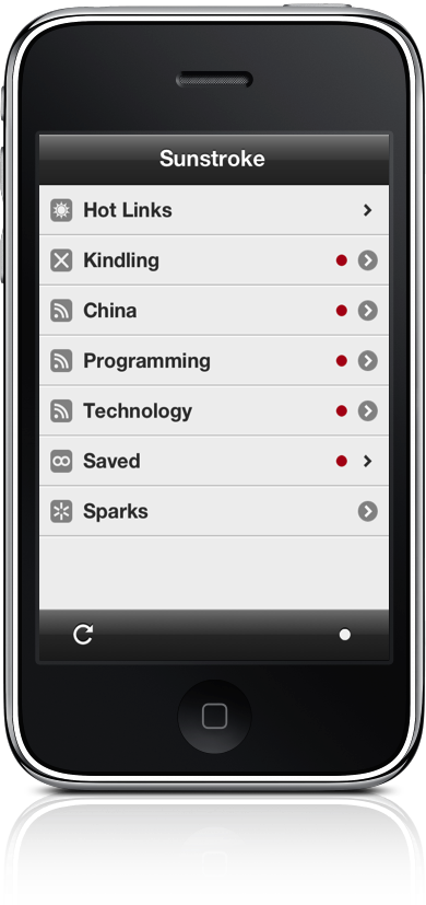
For most of the first year Sunstroke was available, I managed to sell one or two copies a day. I can’t remember exactly, but I’m pretty sure my total income from Sunstroke was less than $1500 for the first twelve months it was available. During that time, I added a lot of features, but the design didn’t radically change until version 1.3. Since I had only earned $1500 total from the app, there was no possibility of hiring a real designer to update Sunstroke’s appearance. I had to muddle along by myself. I improved the UI by constantly trying new ideas, iterating on those ideas, and keeping the ones that seemed to look good to me. Even then, although it began to look a lot more modern (modern, as of two weeks ago before iOS 7 was announced), it was still predominantly gray and unexciting.
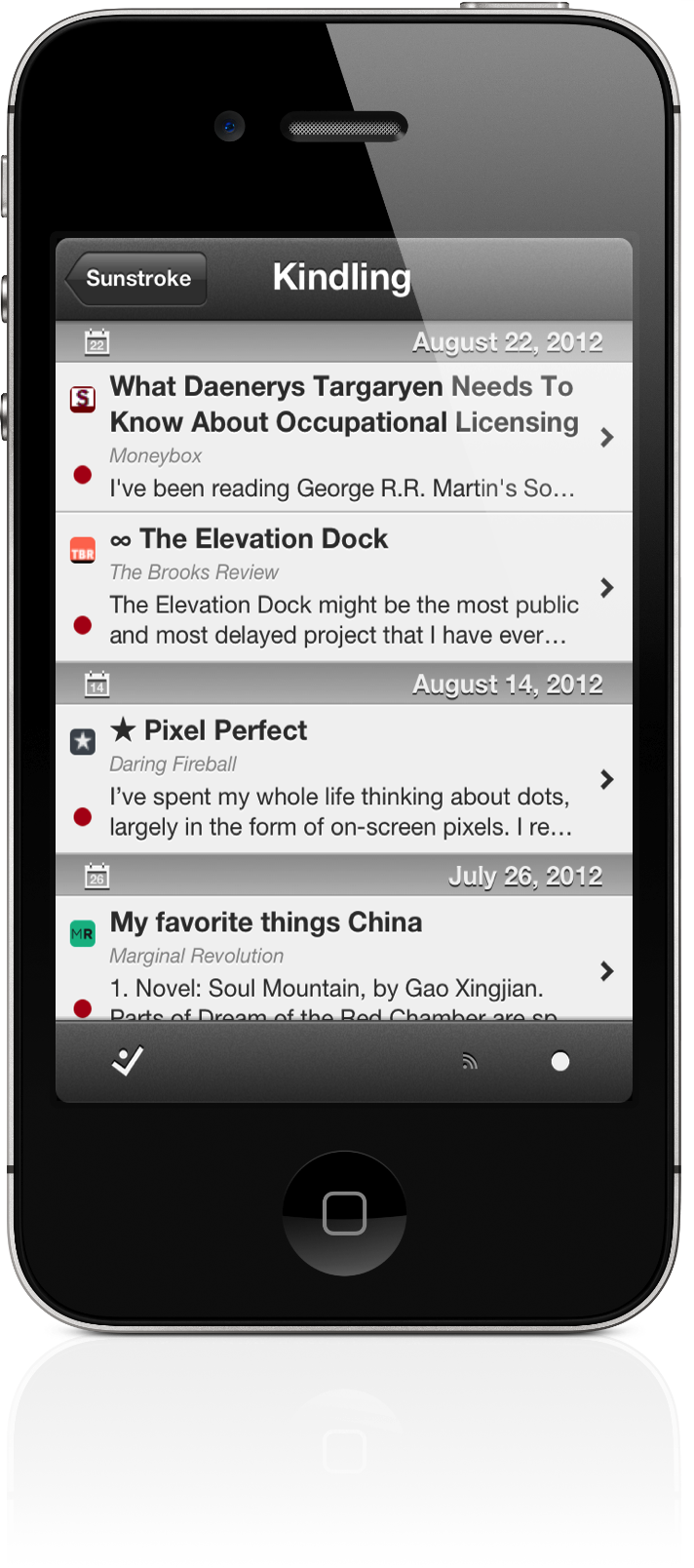
People seemed to be pretty happy with it overall (I’ve managed to hold on to a 4.5 star rating worldwide in spite of—or maybe because of—Sunstroke’s $5 price tag). However, as you may have heard, Google Reader is shutting down soon. All of a sudden, tons of app developers, who previously had never even mentioned Fever, decided that it was a good idea to build Fever support into their apps. Sunstroke, which never before had had any real competition, was suddenly going to be just one Fever client among many. It was obviously necessary to work on bringing Sunstroke’s UI/UX up to par.
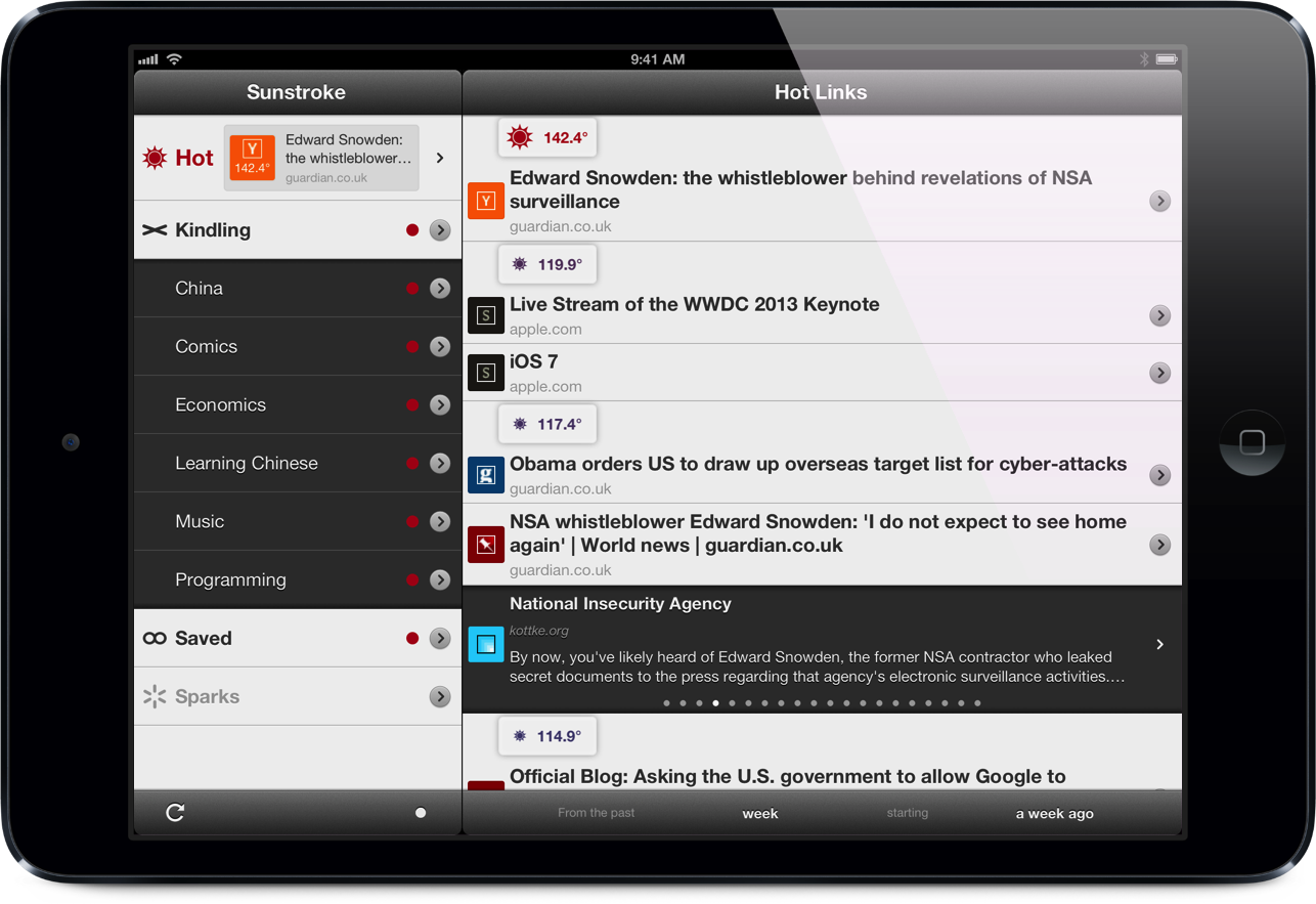
The biggest improvement I wanted to make to Sunstroke was to add more color to the interface. Choosing interface colors is really hard, though, and I still didn’t have any money for a designer. The second most important improvement I wanted to make was to make browsing through your RSS items faster. Thankfully, an idea occurred to me that seemed to address both of these issues. I decided to use the colors contained in your feeds’ tiny favicons and use them to add more color to the interface and also to make the items easier to distinguish from one another. I also used the favicons’ colors to color the background of the cell when you swipe it to mark the items as read or saved or to send it to one of the many sharing services I support (Instapaper, Readability, Pocket, Pinboard, or Pinbook). Even after doing that, I still felt that the interface needed a bit more color to really make it special and more informative. So, app-wide, I added a beautiful blue color to complement the red color that already pervaded Sunstroke. Those two colors serve two primary purposes in the app. In the hot links view, the temperatures of the links vary from red (really “hot) to blue (relatively “cool”). In the standard items list, the publishing date of the items will vary from red (published recently) to blue (published long ago).
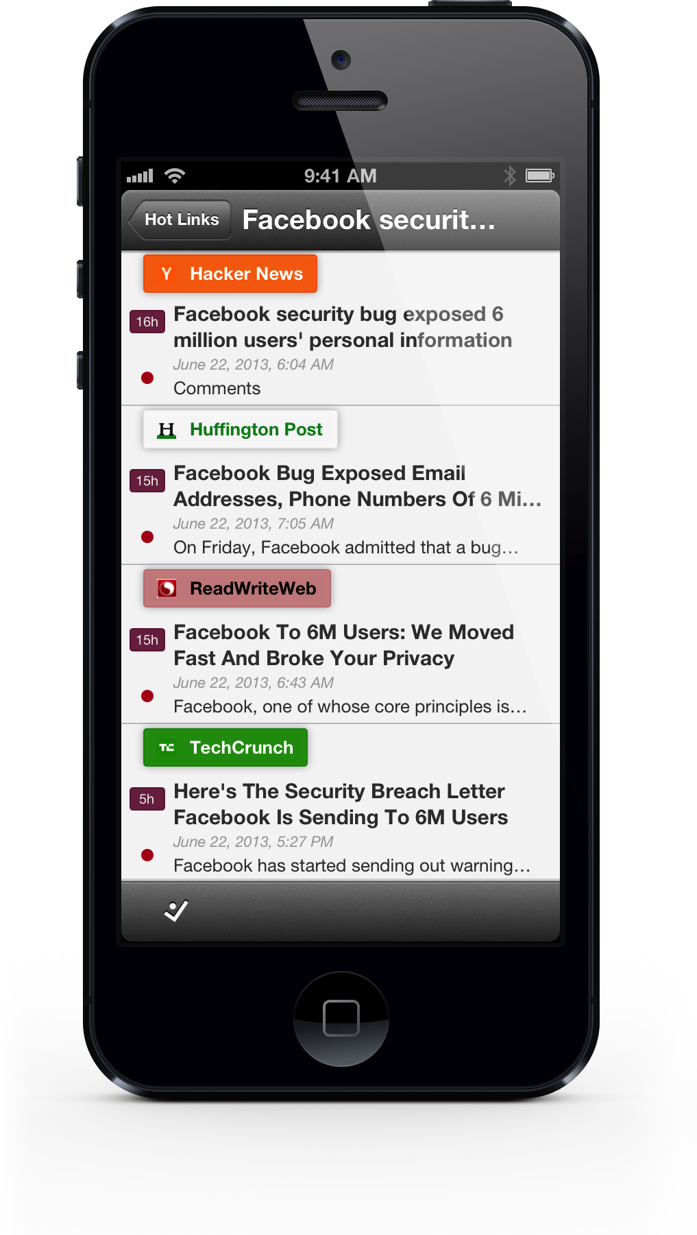
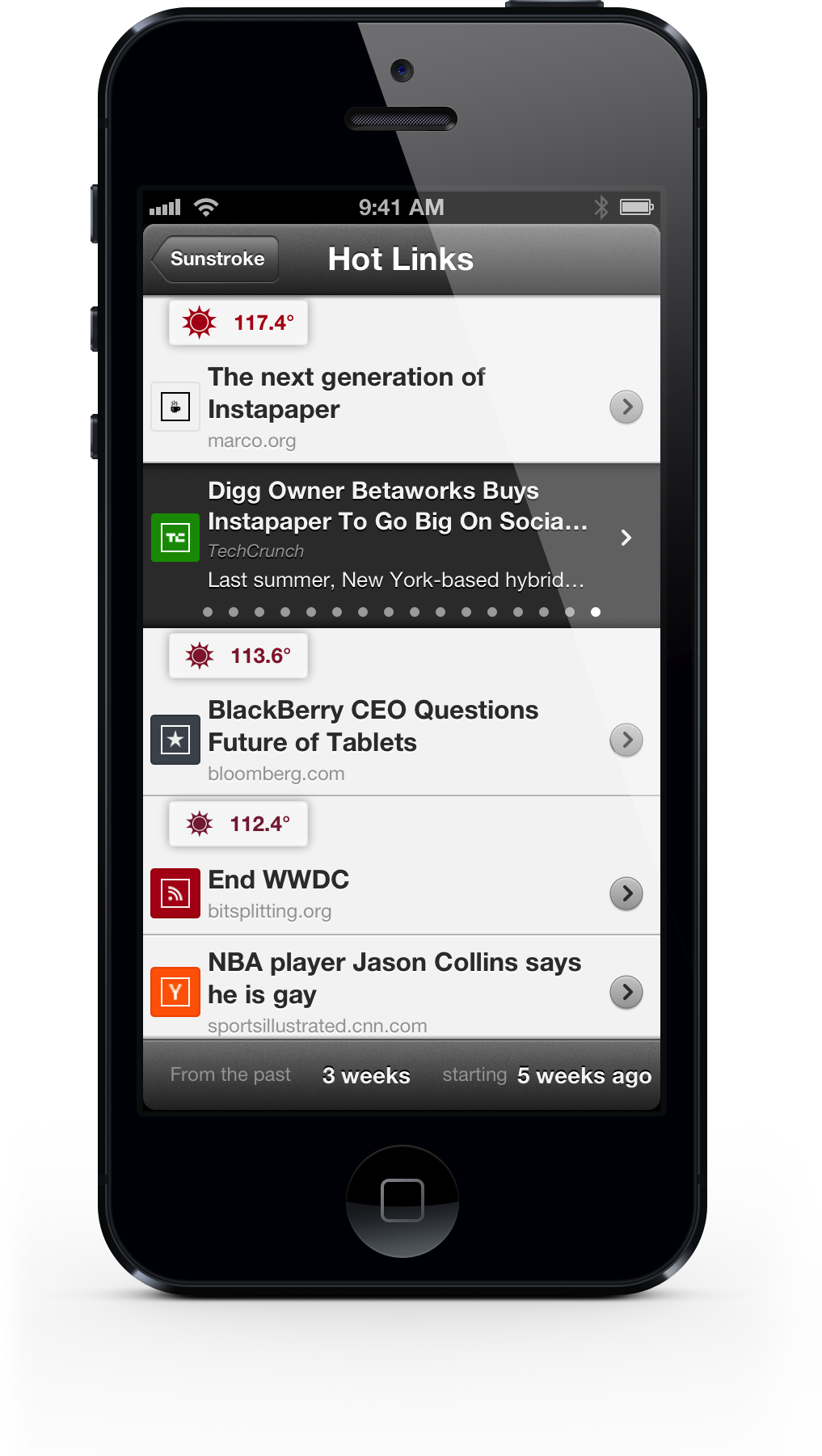
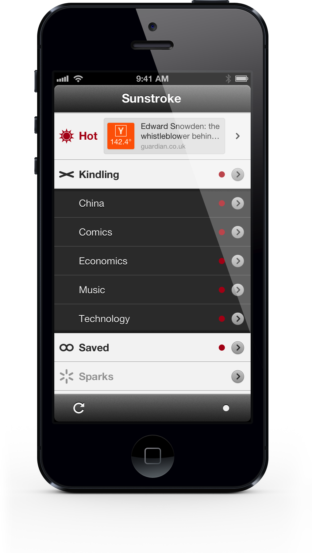
Those changes did a lot to improve the appearance and usefulness of Sunstroke, but, to be honest, the lists of items in Sunstroke had always looked pretty decent. By far, the worst-looking part of Sunstroke was the main “groups” screen. It was always dull and difficult to differentiate between Fever’s super groups (Hot Links, Kindling, Saved, and Sparks) and your groups of feeds (e.g., “Technology” or “Comics”). So, I changed the background color of the groups of feeds and added a drop shadow to make them look recessed (similar to what I had already done in the list of hot links). I still wasn’t satisfied with the state of the main screen. It was too static and uninformative. Additionally, although the real strength of Fever lies in its hot links list, I found that many users didn’t ever access it. I wanted to do something that would prompt my users to take advantage of it. Therefore, I decided to add a featured link to the “Hot” links cell. The featured link updates whenever syncing completes and is tappable. Tapping the featured link will open the built-in web browser and take you directly to the article. I think it looks great, and I use it all the time. (It’s especially useful if you set your hot links list to be from the past “day” starting “now.” )
I made a bunch of other improvements to Sunstroke in version 1.5, but the most critical was a complete re-thinking of the iPad version. In version 1.4, Sunstroke became a universal app. The iPad version was really rough, though. For the most part, it was simply a blown-up version of the iPhone app. Although I’m a big believer in designing an app from scratch for its intended device, in this case, my users were clamoring for an iPad Fever client. I didn’t have enough time to build a brand-new app. Therefore, I adapted Sunstroke’s iPhone interface to the iPad. I wasn’t terribly proud of it, but it worked and satisfied most of my users. For version 1.5, I wanted to make the iPad version more “natively iPad” and more pleasant to use. The biggest change I made was keeping the main groups view and the items lists both visible at the same time. I also modified the text sizes, line heights, and margins of the article view to make it easier to read on the large screen. The iPad version of Sunstroke has finally become a first-class iOS citizen and, for the first time, I find myself using the iPad version more than the iPhone version.
Well, I have a lot more to say about Sunstroke, and there are many improvements in version 1.5 that I haven’t mentioned, but this post is already too long as it is. I hope you all love the new version of Sunstroke. If you haven’t purchased it yet, please buy Sunstroke from the App Store. If you like it, please, please, please leave a positive review in iTunes. I can’t tell you how much that helps. If you don’t like Sunstroke, please contact me and tell me why.
Thanks again to all of my customers for buying Sunstroke and supporting me. I really appreciate it.